Every year we witness new players emerging in the space of eCommerce platforms. More than often, they come out of nowhere and disappear before gaining any significant traction, but sometimes we have a chance to look at very promising candidates from companies with strong reputation in the field. Here’s one of the latter: an eCommerce platform from Oro Inc, the creators of a quite powerful open-source CRM system – OroCRM. Though it’s still in the beta testing stage at this point, we simply couldn’t miss the opportunity to dig into a new product from the company we’ve worked with for years. Meet OroCommerce!
The OroCommerce is based on the OroPlatform – the same platform that is used as a basis for OroCRM. The new platform is B2B-oriented (Business to Business). Because of that, it has a little bit different behavior in comparison with the usual functionality of B2C eCommerce platforms. But the general principles are the same, it has a storefront and an admin panel, it has products, a shopping cart (shopping list), a checkout and all other traditional components. Let’s review separate parts of the system in details.
Installation
I must admit that the installation is very smooth. Those who tried to install early alpha/beta versions of OroPlatform/CRM remember that you could spend many hours on different issues during the installation process. The only thing you need to do is to ensure that the system requirements are satisfied, the folder permissions are set correctly and you have a recent Composer version. You also need to have the database access credentials by your hand. From this point, the process of installation takes just few clicks. We have tried to install the system several times on different servers and got no unpredictable issues at all.
Storefront
At the very end of the installation process you are able to choose the sample data installation. This way, right after the installation you are able to test the store functionality without the necessity to manually create products and other entities.
The general page layout is quite standard: you have a set of quick links, main navigation menu with mini cart in the header and the footer with links.
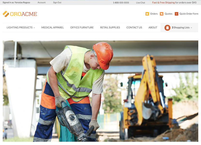
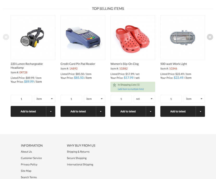
The storefront home page with standard sample data looks traditional for eCommerce stores. It has a section with promotional banners, featured categories, featured products etc.
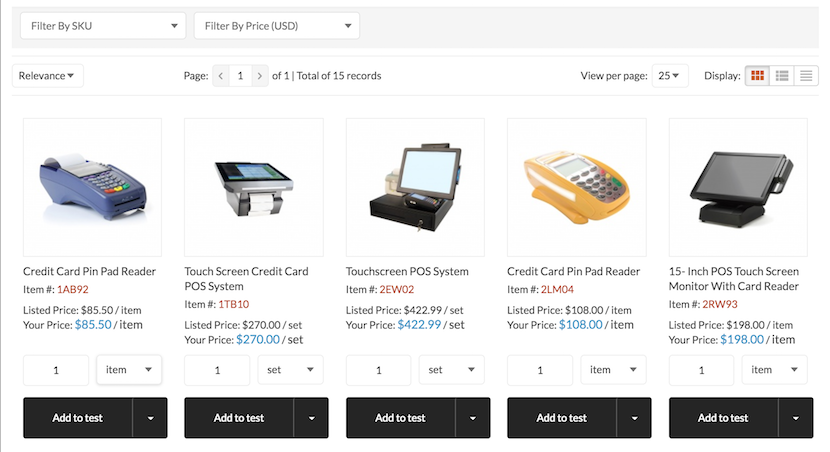
On the category view page you are able to select one of the 3 views: grid view, list view, or no images list view. At the very top of the category page we can see a product filter that uses the standard OroPlatform UI component for grid filtering.
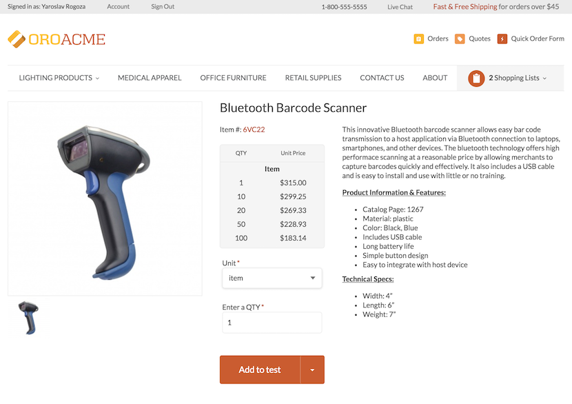
The product details page is simple and clean. Here you can find a product image gallery with simple zoom, product description, attributes and QTY chooser.
As usual, the storefront has some CMS pages that can be easily edited via admin panel.
Checkout
The checkout items and the process itself have some particularities that are related to B2B orientation of the platform. Instead of the standard shopping cart, you have shopping lists. There’s an ability to create a new shopping list and add products to separate shopping lists. When you decide to finish shopping and go to checkout you can choose any of your lists and checkout the chosen list. The system also has a great feature – multiple warehouses out of the box.
Also the system has a quick order feature. You can fill the quick order form with item numbers and QTYs and quickly create a list or even an order with the selected set of products.
Alongside with the standard checkout you have an ability to request a quote by filling in additional information and submitting your shopping list. The store admin gets your quote and has an ability to contact you to clarify further details or create an order based on the quote.
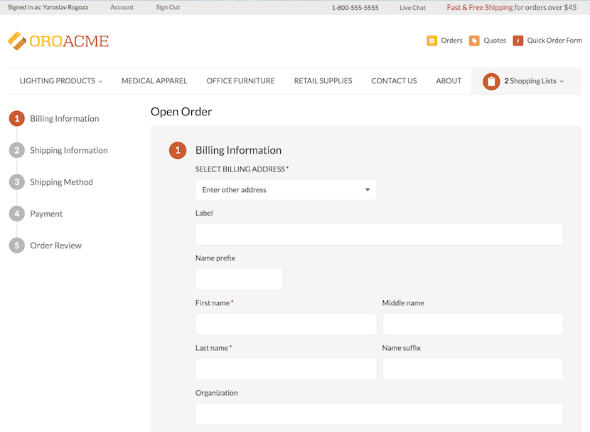
The checkout process is divided into 5 steps:
- Billing Information
- Shipping Information
- Shipping Method
- Payment
- Order Review
At this moment you only have few payment methods out of the box: Paypal Payments Pro, Payflow Gateway and a good old Check/Money Order.
There are no shipping methods integrations at this moment. You should only specify a shipping address and the delivery process is up to the store owner.
The Admin Panel
At first you may think that you have entered a wrong URL or were logged into some OroCRM installation because the admin panel’s look and feel is very similar:
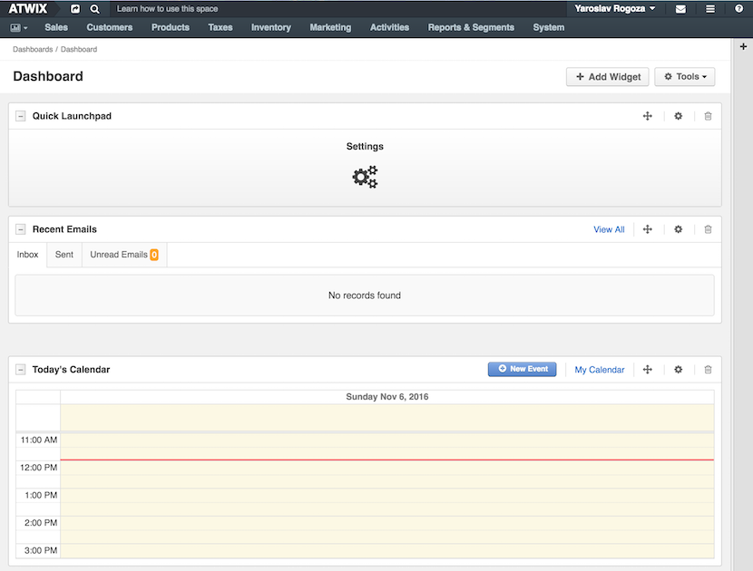
The navigation menu is intuitive enough. You don’t need to browse a lot to find where to edit a product or view the order list. Here you can get familiar with some B2B features such as customer segments, calendar events, warehouse management, price lists etc.
The system configuration section doesn’t have many options at this moment, but we are sure that this situation will be changed soon.
Performance
The overall system performance is really not bad. With the standard caching the home page and the product details pages are quite fast. The only slow place we’ve noticed are the product list pages. The loading time for these pages is significantly slower in comparison with other pages. However, system developers had implemented the lazy loading for the product grid and that is a very good starting step (especially from the SEO perspective). The shopping list page and the checkout itself are fast as well.
As for the admin panel performance, it’s really impressive. The OroPlatform developers had a chance to improve their system performance and they have a noticeable success with it.
Conclusion
It’s hard to say any final words about the platform on the early stage. We are sure that there are many challenges that the system will face. However, the initial steps are very promising and we believe that in the nearest feature we will see a growing community that will help the system become a powerful player on the eCommerce platform market.
