If you have ever developed the bundles for OroCRM, you should know that there is a need to add a button to different places. OroCRM developers can find many ways of adding different types of buttons on the pages. And our article will describe the general button’s types.
Today we will not create a new test bundle – and, as an example, we will use OroCRM bundle. Despite this, if you need to create own bundle but do not know how to do it – you are welcome to read our tips in the previous article related to OroCRM topic.
So, let’s start – when you want to add a button to own template, you should place the Oro UI template at the top of your template, and for this, just add the following code line in the beginning of your template.
{% import 'OroUIBundle::macros.html.twig' as UI %}
For the purpose of this explanation, we will add the buttons to the navigation part of the page.
{% block navButtons %}
   … some code ….
{% endblock %}
Of course, you can add buttons to any different place that you wish. All in all, you are able to create a lot of different buttons with different styles and functionality. For example, add the code to you Twig template:
{{ UI.button({
        'path':  path('orocrm_account_index'),
        'aCss':  'btn btn-large btn-success action-button',
        'iCss':  'icon-ok',
        'label': 'Atwix test button',
        'title': 'Atwix test button',
    }) }}
This simple OroCRM button has a link to orosite.dev/account, labeled as “Atwix test button”, look at the screenshot:
The parameters array for the single button are:
 'path'  - button URL
 'aCss'  - additional button class
 'title' - button title
 'iCss'  - CSS class for 'i' tag (icon)
 'label' - button label
And when we look into the code, we will find the following:
<a href="/app_dev.php/account" class="btn back icons-holder-text btn btn-large btn-success action-button" title="Atwix test button"><i class="icon-ok hide-text">Atwix test button</i>Atwix test button</a>
As you see, we can use different styles for many actions. What if we change the style ‘aCss’ parameters? There are native classes – so, you can add or change the classes to have the different buttons. For example:
btn-primary
    'aCss':  'btn btn-large btn-primary action-button',

btn-group
    'aCss':  'btn btn-large btn-info action-button',

btn-group
    'aCss':  'btn btn-large btn-success action-button',

btn-danger
    'aCss':  'btn btn-large btn-danger action-button',

btn-warning
    'aCss':  'btn btn-large btn-warning action-button',
Moreover, you can change the icons for your buttons. There is a great variety of the icons, simply use Font-Awesome icons version 3.2.1. For instance, change ‘iCss’ parameter:
   'iCss':  'icon-trash',
   'iCss':  'icon-ok',
   'iCss':  'icon-remove',
   'iCss':  'icon-skype',
That is all for the simple buttons – as you can see, we do not make much effort to add any button with different styles.
Moreover, you can use simple buttons everywhere, but the easiest way is when you use buttons with the native functionality. In this case, you should add only the code snippet to you Twig template. Let’s create the “Cancel” button:
{{ UI.cancelButton(
   path('orocrm_account_index')
) }}
This button will redirect you to the specified URL. And there is only one required parameter “path” – the “label” parameter is not required, but you can change it whenever you want.
    'path' - button URL
    'label' - button label (it is not required, has the label 'Cancel' by default)
Now, create the “Edit” button:
{{ UI.editButton({
        'path' : path('orocrm_account_update', { id: id }),
        'entity_label': 'Edit'
 })  }}
This button redirects you to some already added URL. There is only one required parameter “path” – similar to UI.cancelButton, but this particular button has more parameters that are not required.
    'path'  - button URL
    'aCss'  - additional button class (it is not required)
    'title' - button title (it is not required, has the label 'Edit' by default)
    'label' - button label (it is not required, has the label 'Edit' by default)
    'entity_label' - if specified it will be added for title and label
And we can delete button with JavaScript handler:
   {{ UI.deleteButton({
        'dataUrl': path('orocrm_account_view', {'id': 13}),
        'dataRedirect': path('orocrm_account_index'),
        'aCss': 'no-hash remove-button',
        'id': 'btn-remove-business_unit',
        'dataId': 13,
        'entity_label': 'Delete',
        'disabled': false
    }) }}
This button runs a code with such parameters:
    'aCss' - additional CSS class for 'a' tag
    'dataId' - data-id parameter
    'dataMessage' - message before delete record
            ('Are you sure you want to delete this %entity_label%?' by default)
    'dataRedirect' - URL to redirect after delete
            ('%entity_label% deleted' by default)
    'dataUrl' - data-url parameter
    'title' - button title ('Delete' by default)
    'label' - button label ('Delete' by default)
    'entity_label' - if specified will be added for title,
            label and messages('item' by default)
    'disabled' - if true this control is rendered as disabled
Here is the information about how to create the “Add” button. This button redirects you to the specified URL too, but it has own styles. We can see only one required parameter “path” there.
    {{ UI.addButton({
        'path' : path('orocrm_account_create'),
        'entity_label': 'Add'
    }) }}
    'path'  - button URL
    'aCss'  - additional button class
    'title' - button title ('Create' by default)
    'label' - button label ('Create' by default)
    'entity_label' - if specified, it will be added for title and label
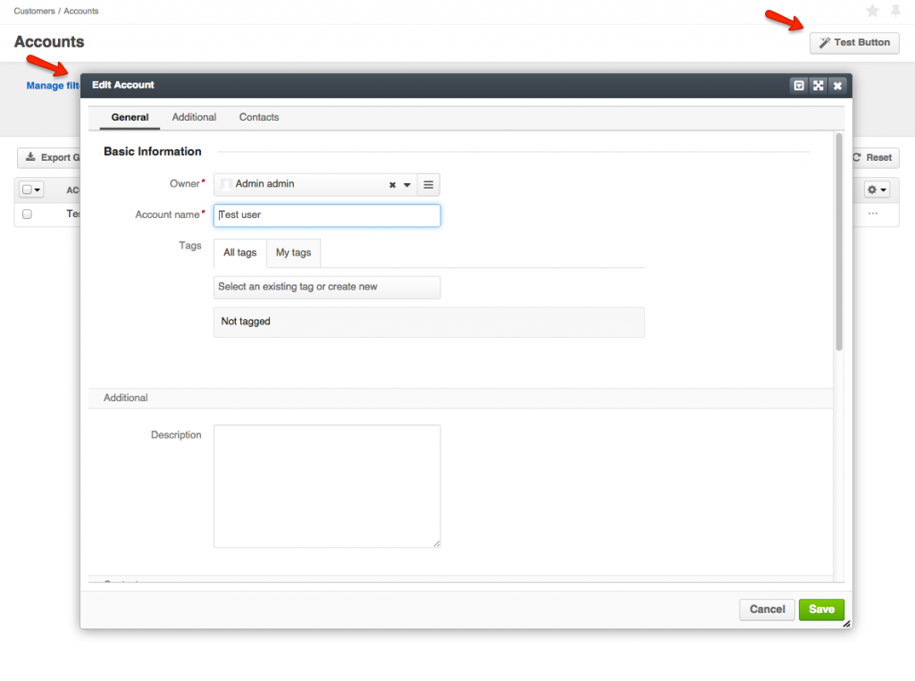
We are moving on – note that your activity should be assigned if you want to add the activity button to the view page of the entity. So, create two Twig templates responsible for the button’s rendering. Also, it is important to add both templates since an action that will be rendered depends on the button. In this example, we create a button which displays “widget” with the template of the update action. Sometimes, it is quite good way because you can add some action without redirecting a user to another page. We should add the code of the button of our template and specify an action which renders the necessary Twig template. In this example, we use the native OroCRM “account update” action.
{{ UI.clientButton({
        'dataUrl': path('orocrm_account_update' , {'id': id }),
        'aCss': 'no-hash',
        'iCss': 'icon-magic',
        'label' : 'Test button',
        'widget' : {
            'type' : 'dialog',
            'multiple' : true,
            'refresh-widget-alias': 'activity-list-widget',
            'options' : {
                'alias': 'atwix-test-bundle',
                'dialogOptions' : {
                    'title' : 'Edit account',
                    'allowMaximize': true,
                    'allowMinimize': true,
                    'dblclick': 'maximize',
                    'maximizedHeightDecreaseBy': 'minimize-bar',
                    'width': 1000
                }
            }
        }
    }) }}
And parameters array is:
    'class' - default class
    'aCss' - additional CSS class for 'a' tag
    'iCss' - additional CSS class for 'i' tag
    'dataId' - data-id parameter
    'dataUrl' - data-url parameter
    'dataRedirect' - URL to redirect after an operation finished
    'successMessage' - a message which will be shown after an operation finished
    'title' - button title
    'label' - button label
    'visible' - determined whether the button is visible or not. Default is true
    'dataAttributes' - additional data attributes

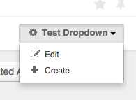
But how can we create a “dropdown” button? It’s worth mentioning that the dropdown is more convenient for using. We need to add two blocs: in the first one – we add the dropdown items (they can contain HTML code or another blocs, or even some buttons). The second block is the dropdown’s wrapper that contains our items.
Take a look at the example of the code of the dropdown’s block:
{{ UI.dropdownButton({
    'label': 'Test dropdown',
    'iCss': 'icon icon-cog',
    'aCss': 'pull-right',
    'html': 'html'
}) }}
Parameters’ array:
    'label' - button label
    'elements' - dropdown elements
    'html' - our items block;
    'aCss'  - additional drop down class
Create the dropdown button item:
  {% set html %}
            {{ UI.dropdownItem({
            'path': path('orocrm_account_update', {id:3}),
            'title': 'oro.dashboard.edit_dashboard_link.title'|trans,
            'label': 'oro.dashboard.edit_dashboard_link.text'|trans,
            'iCss': 'icon-edit'
            }) }}


            {{ UI.dropdownItem({
            'path': path('orocrm_account_create'),
            'title': 'oro.dashboard.create_dashboard_link.title'|trans,
            'label': 'oro.dashboard.create_dashboard_link.text'|trans,
            'iCss': 'icon-plus'
            }) }}
    {% endset %}
And here the parameters array is:
    'path'  - button URL
    'aCss'  - additional button class
    'title' - button title
    'iCss'  - CSS class for 'i' tag (icon)
    'label' - button label
As you can see, we have many ways to add a button in OroCRM, just follow the creation rules of the Twig template.
Have you had any other experience with buttons creation in OroCRM? We are looking forward to receiving your suggestions in the comments below.


